Gray and Cream Living Room Ideas That Actually Work
3 Hook Options
- Gray and cream is the pumpkin spice of living rooms — everyone tries it, most people get it wrong, and when it’s done right, it’s genuinely perfect.
- There are 50 shades of gray that work in a living room. There are 150 that don’t. Here’s how to tell the difference.
- The secret to gray and cream isn’t the colors — it’s the ratio and the third color you add. Here’s the complete system.
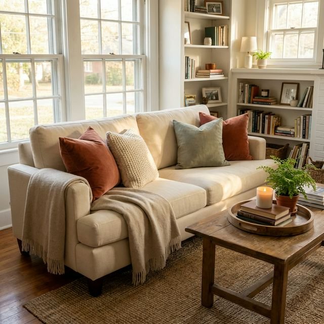
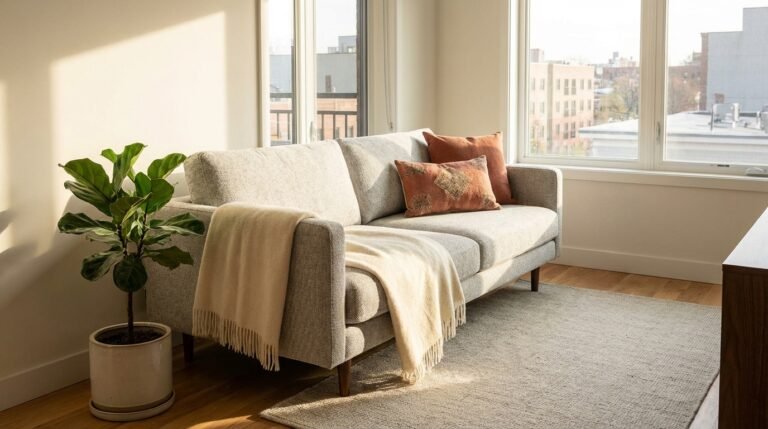
Hero Image: Stunning gray and cream living room — warm gray walls, cream sofa, textured throws, wood accents, warm lighting. Feels cozy, not clinical. Photorealistic.
Gray and cream is the pumpkin spice of living rooms — everyone tries it, most people get it wrong, and when it’s done right, it’s genuinely perfect.
Here’s the problem: without warmth and texture, gray + cream = cold and boring. You’ve seen those rooms. They look like a hospital waiting room designed by someone who loves IKEA.
But done right? Gray and cream creates spaces that feel calm, sophisticated, and endlessly livable. In this guide, you’ll learn the one rule that makes gray and cream work (the 60/30/10 ratio), see 15 styled room ideas with specific paint colors and products, and discover exactly which third color to add so your room doesn’t feel like a design mistake.
Why Gray and Cream Fails (and the One-Rule Fix)
Let’s diagnose the problem first. Most gray-and-cream rooms fail for one reason:
They choose the wrong gray.
Cool gray (with blue undertones) + stark cream = cold and flat. It’s a combination that looks clinical rather than cozy.
The fix: Always use warm gray OR pair cool gray with warm wood elements to balance.
Here’s the rule that saves everything:
> “If your gray has blue undertones, your room needs warm wood to balance. If your gray has taupe undertones, you’re already halfway there.”
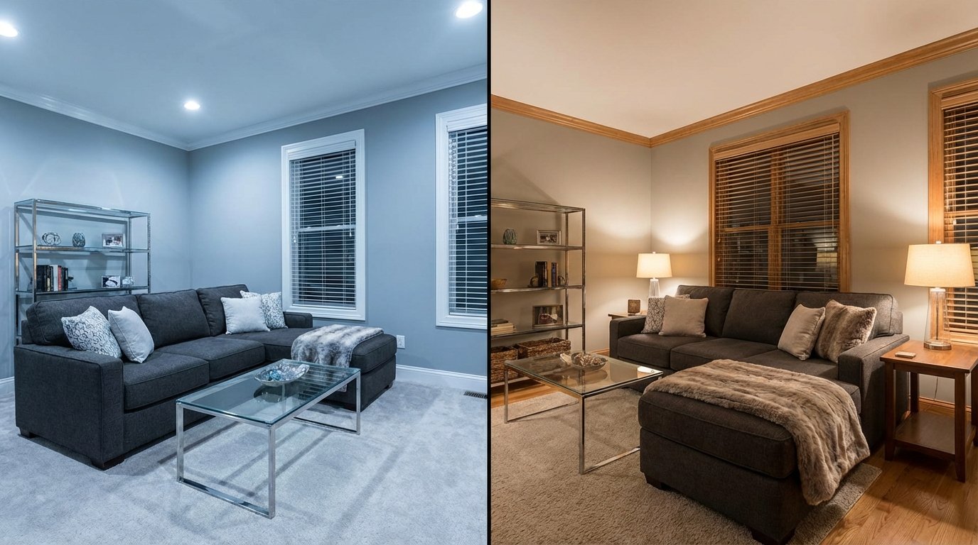
Image: Side-by-side — cool gray room (feels sterile) vs. warm gray room (feels inviting). Same furniture, different gray. Photorealistic.
This same principle applies whether you’re going full neutral or just want to understand warm vs cold minimalism in your overall design approach.
The 60/30/10 Rule for Gray and Cream
This is the framework that makes neutral rooms work. Every successful gray-and-cream room follows this ratio:
| Percentage | Role | Example |
|---|---|---|
| 60% | Dominant (walls + large surfaces) | Cream walls |
| 30% | Secondary (furniture + rugs) | Gray sofa + gray rug |
| 10% | Accent (pillows, art, decor) | Gold, sage green, blush, black |
You can also flip it: 60% gray walls, 30% cream furniture, 10% accent.
The 10% accent color is what separates “nice” from “WOW.” Without it, you have a neutral room. With it, you have a designed room.
Warm Gray vs Cool Gray — Which One Do You Have?
This is the question that determines everything else in your room. Here’s how to tell:
| Warm Gray (Greige) | Cool Gray | |
|---|---|---|
| Undertone | Beige, taupe, yellow | Blue, purple, green |
| Feels like | A sweater on a fall day | A modern art gallery |
| Pairs with | Wood, cream, terracotta | White, black, silver |
| Best for | Cozy rooms, bedrooms, living rooms | Modern spaces, bathrooms, offices |
| Paint example | SW Agreeable Gray | BM Stonington Gray |
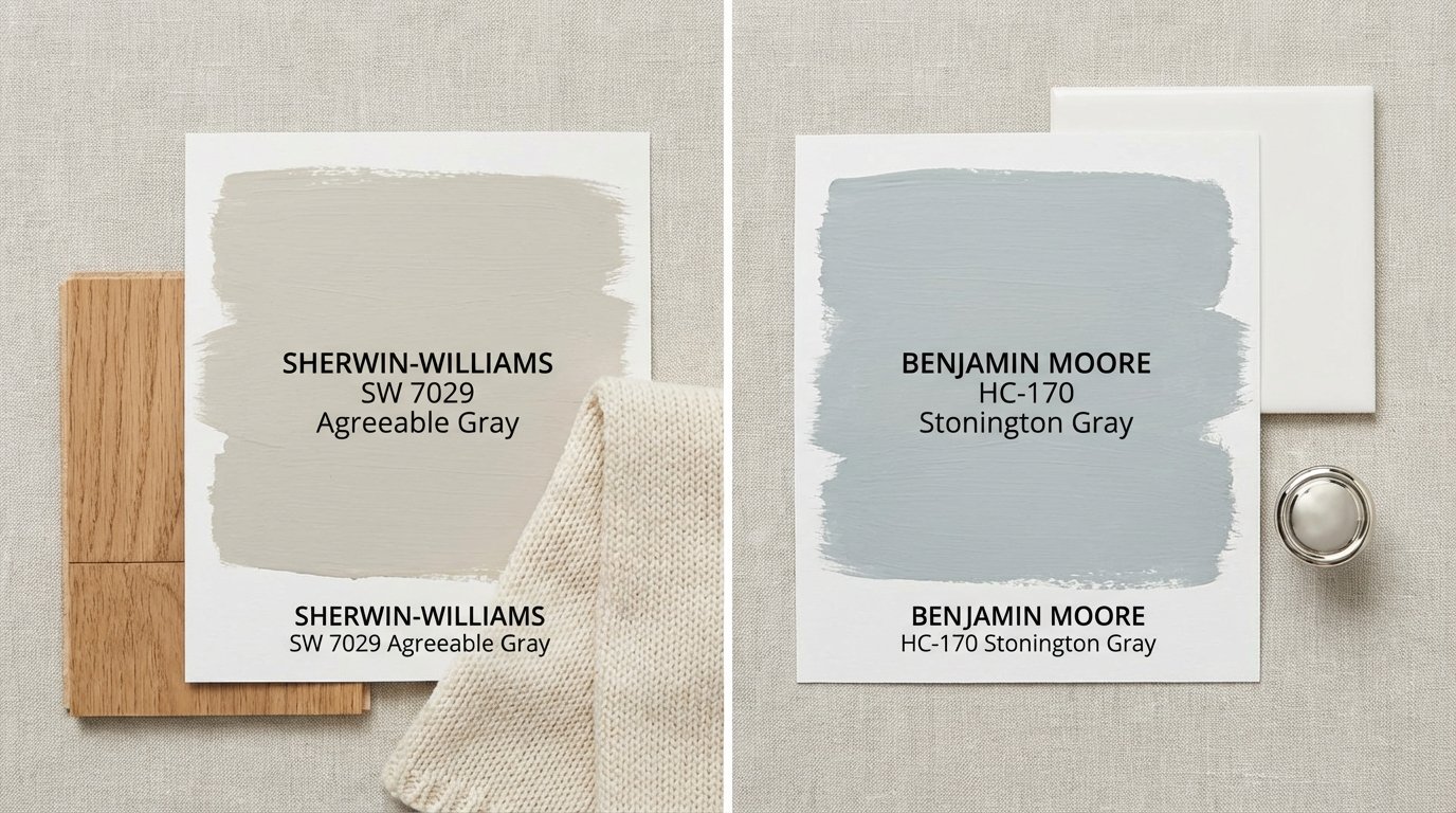
Image: Two painted squares — warm gray (SW Agreeable Gray) vs. cool gray (BM Stonington Gray). With fabric and material pairings next to each.
Quick test: Hold a piece of white printer paper next to your paint chip. If the gray looks slightly purple or blue beside it, you have cool gray. If it looks slightly brown or beige, you have warm gray.
Want to know how this fits into what’s trending in 2026? Warm tones are having a major moment.
3 Gray + Cream Sub-Styles
Once you know your gray, pick your style direction:
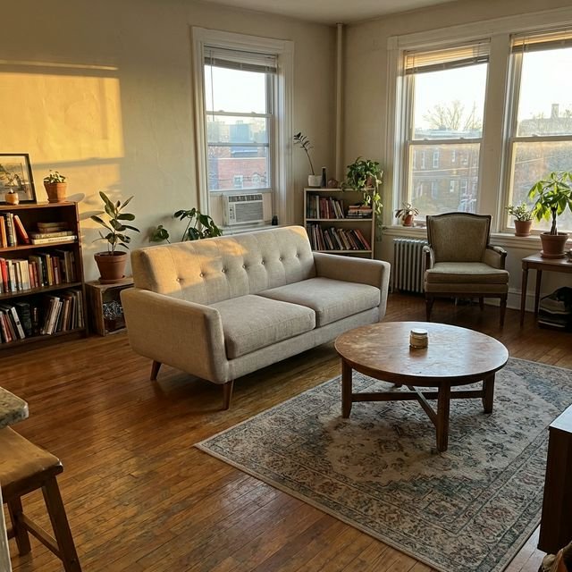
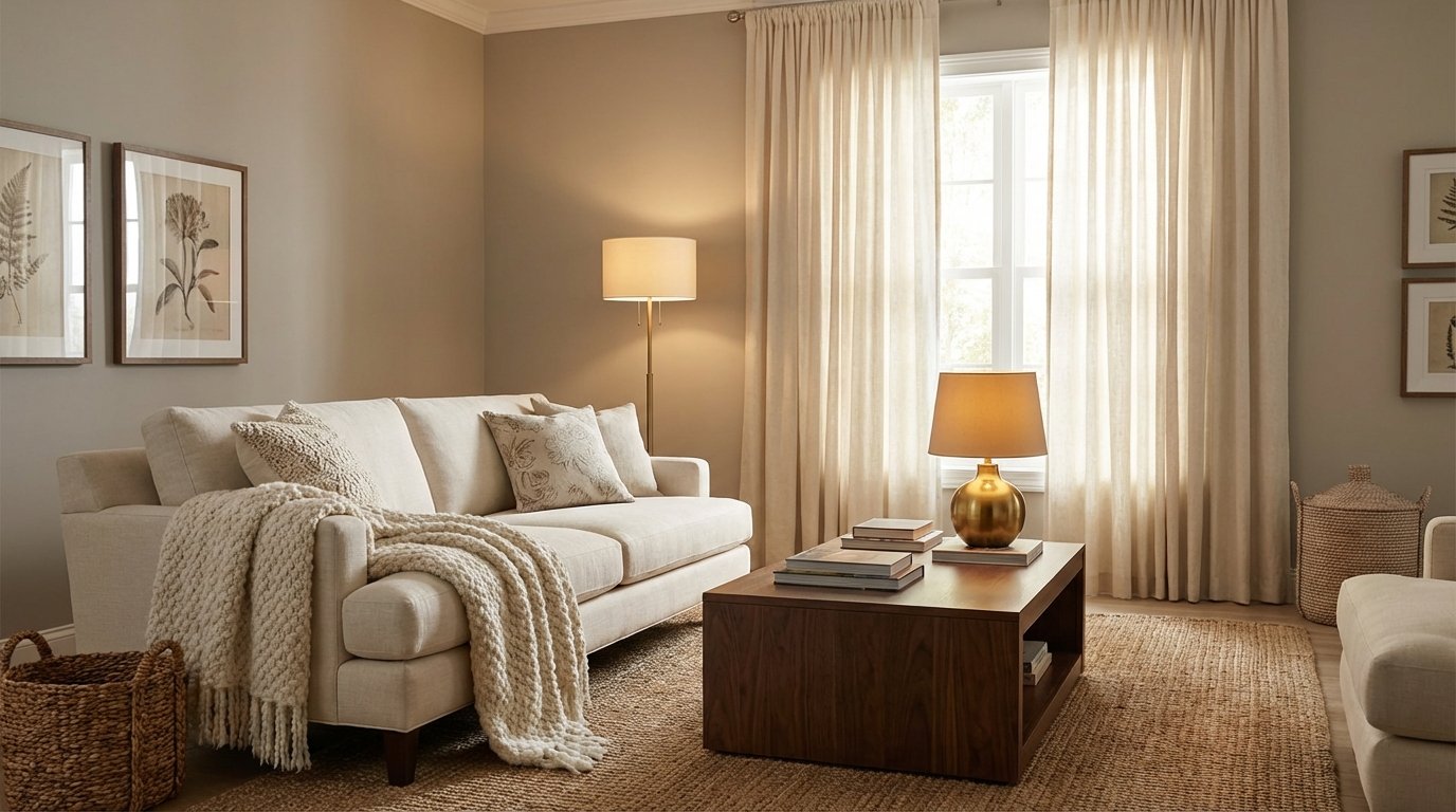
Modern Warm (Most Popular 2026)
- Warm gray + warm cream + brass accents + linen textures
- Accent color: dusty gold or sage green
- Vibe: Sophisticated but livable, not trying too hard
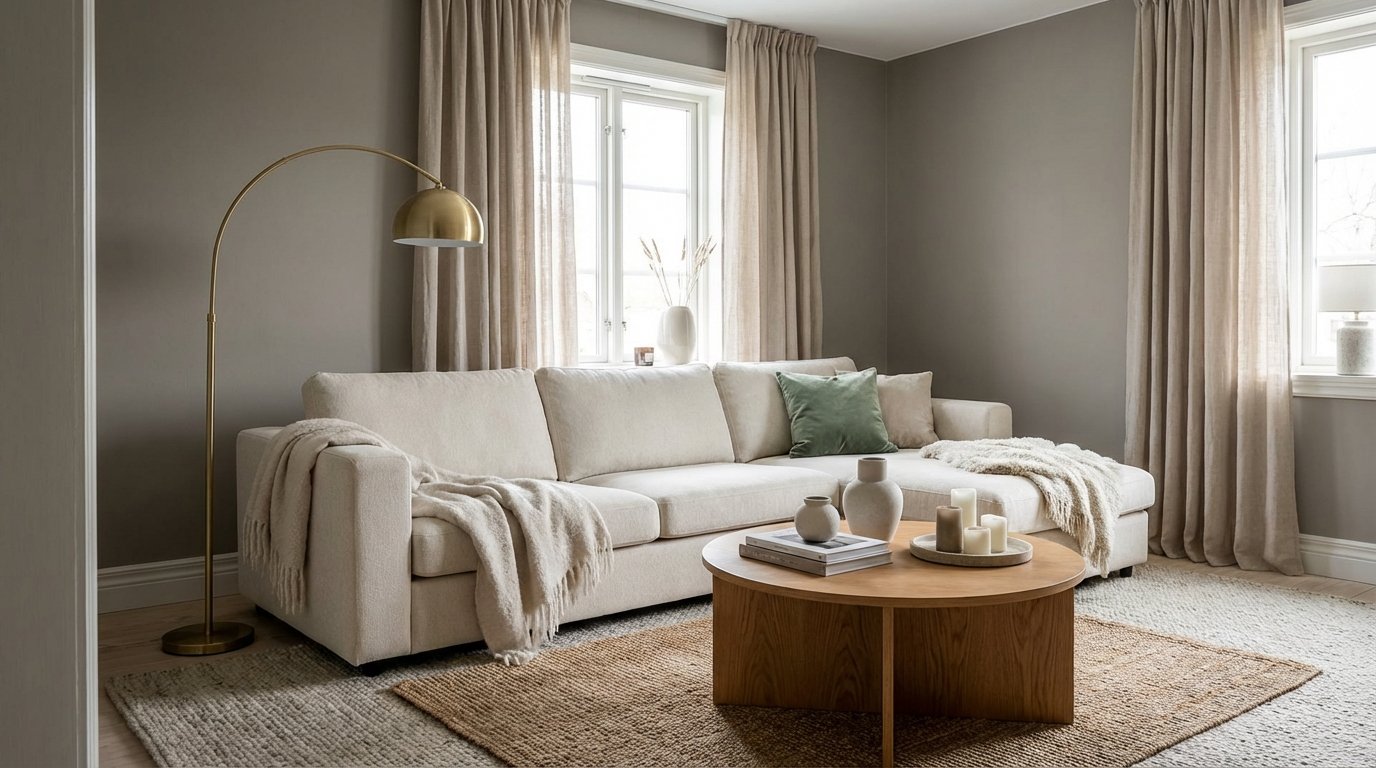
Image: Modern warm gray+cream living room — brass lamp, linen curtains, warm wood coffee table. Photorealistic.
This look pairs beautifully with complete cozy styling for a room that feels as good as it looks.
Coastal Gray
- Cool gray + warm white + natural textures (jute, driftwood) + blue accents
- Accent color: soft blue or aqua
- Vibe: Relaxed, beachy, always feels like vacation
For the finishing touch, add a gallery wall with coastal art prints.
Cozy Traditional
- Dark gray + warm cream + rich textures (velvet, wool) + deep accents
- Accent color: forest green, burgundy, or navy
- Vibe: Library energy, perfect for reading and fireside lounging
The Accent Color Wheel (The Secret Third Color)
This is what takes gray-and-cream from “safe” to “stunning.” Your third color choice defines the mood:
| Gray+Cream + … | Mood | Example Products |
|---|---|---|
| + Gold/Brass | Elegant, warm | Brass lamp, gold frame |
| + Sage Green | Natural, serene | Green throw pillows, plant |
| + Blush Pink | Soft, feminine | Pink cushions, blush vase |
| + Navy Blue | Classic, sophisticated | Navy pillow, blue art |
| + Black | Modern, crisp | Black frames, decor |
| + Terracotta | Earthy, 2026 | Clay vase, rust cushion |
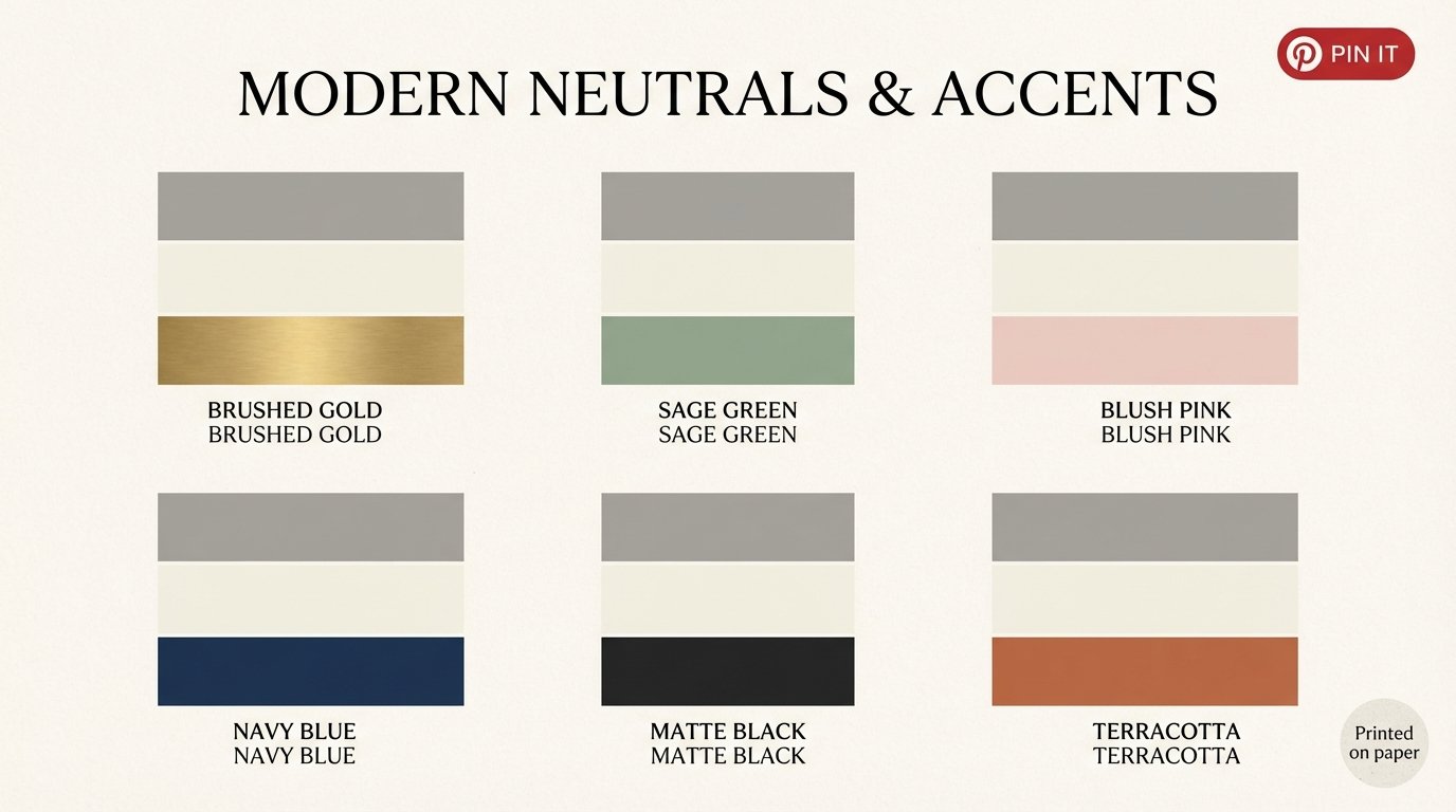
Image: 6 color palette swatches — gray+cream+accent for each option. Clean, visual, pinnable.
My recommendation for beginners: Start with gold/brass. It’s the most forgiving accent color and adds instant warmth to any gray-and-cream room.
Specific Paint Picks (With Undertones Explained)
Stop guessing at the paint store. Here are the proven winners:
| Paint | Brand | Tone | Best For |
|---|---|---|---|
| Agreeable Gray | Sherwin Williams | Warm gray | Most living rooms |
| Revere Pewter | Benjamin Moore | Warm gray | Open floor plans |
| Alabaster | Sherwin Williams | Warm cream | Walls (with gray furniture) |
| White Dove | Benjamin Moore | Warm cream | Trim and ceilings |
| Repose Gray | Sherwin Williams | Neutral gray | Cool+warm balance |
Pro tip: Always test paint samples in YOUR room during different times of day. That “warm gray” can look surprisingly blue in north-facing light.
When you’re ready to choose bedroom colors, these same principles apply — just lean slightly warmer and softer.
15 Gray and Cream Living Room Ideas
1. The Agreeable Gray Classic
SW Agreeable Gray walls + cream sectional + gold accents + warm wood coffee table. This is the “works every time” combo.
2. High-Contrast Drama
Dark charcoal accent wall + cream sofa + black frames + gold lamp. Bold but not overwhelming.
3. Soft Greige Sanctuary
Revere Pewter walls + cream linen sofa + sage green pillows + jute rug. Layered neutrals that feel alive.
4. Cool Gray, Warm Everything
Stonington Gray walls + cream furniture + warm wood floors + brass everywhere. The cool gray makes the warm elements pop.
5. Monochromatic Cream-on-Cream
Warm cream walls + cream sofa + cream rug (texture variations) + gray throw blanket. Subtle and sophisticated.
6. Two-Wall Wonder
Gray on two walls, cream on two walls, placed opposite each other. Creates depth without going full gray.
7. Gray Sectional, Cream Everything
Light gray sectional + cream rug + cream walls + wood accents. The sectional becomes the statement.
8. Velvet Moment
Cream velvet sofa + charcoal walls + gold mirror + blush pillows. Luxurious without being stuffy.
9. Earthy Gray
Warm gray with green undertones (sage gray) + cream + terracotta accents + lots of plants. Very 2026.
10. Minimalist Neutral
Light gray walls + cream sofa + black accent pieces + minimal decor. Clean and intentional.
11. Textured Layers
Gray walls + cream sofa + sheepskin throw + linen curtains + wool rug. Interest through texture, not color.
12. Gallery Wall Gray
Gray walls as backdrop for cream-and-gold gallery wall. The art becomes the accent.
13. Navy + Gray + Cream
Gray walls + cream sofa + navy blue accent pillows + brass lamp. Classic, preppy, always works.
14. Farmhouse Neutral
Warm gray shiplap walls + cream slipcovered sofa + vintage wood + black accents. Modern farmhouse energy.
15. Glam Gray
Charcoal walls + cream velvet sofa + gold chandelier + mirrored coffee table. Evening-ready elegance.
FAQ
Is gray and cream a good color combination?
Yes — it’s one of the most versatile and timeless combinations. The key is choosing the right undertones (warm gray with cream, or cool gray balanced with warm wood) and adding a third accent color for interest.
What accent color goes with gray and cream?
The best accent colors are gold/brass (warmth), sage green (natural), navy blue (classic), black (modern), blush pink (soft), or terracotta (earthy). Pick one and repeat it in 2-3 places.
What shade of gray goes best with cream?
Warm grays (greiges) like Sherwin Williams Agreeable Gray or Benjamin Moore Revere Pewter work beautifully with cream. Cool grays can work if you add warm wood elements to balance.
Is warm gray or cool gray better for living rooms?
Warm gray is generally better for living rooms because it feels more inviting and cozy. Cool gray can feel sterile in a main living space unless balanced with warm materials like wood and brass.
How do I make a gray room feel warm?
Add warm wood furniture, brass or gold accents, warm lighting (2700K bulbs), textured throws and pillows, and warm accent colors like terracotta, gold, or rust.
What to Read Next
- Cozy Living Room Ideas on a Budget — Make your gray-and-cream room feel as good as it looks
- Living Room Wall Decor Ideas — Art and styling for neutral walls
- Warm Minimalism vs Cold Minimalism — The design philosophy behind these tones
- Bedroom Colors for Better Sleep — Apply the same principles to your bedroom